When it comes to the Galaxy Z Fold 5, even Samsung can’t get much love from Google
Google seems to prioritize only its Pixel Fold for app support, even though no one buys them.

People talk a lot of smack about Microsoft, and, at least when it comes to smartphones, much of it is earned. One of the issues with Microsoft’s Surface Duo line was trying to pick up support for dual-screen and spanned app experiences. While third-party apps were expected to trail, it was odd that Google never did much either, even though it supposedly wanted to drive dual-screen and foldable smartphones.
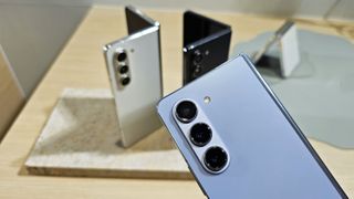
I recently picked up the new Samsung Galaxy Z Fold 5 while visiting Samsung in Korea. I’ll have more on the device in the coming days, especially to see if Samsung addressed my complaints about the Z Fold 4. But one thing that bothers me is many of Google’s apps are still not optimized for Samsung’s Z Fold series even as it hits its 5th generation, initially launching in 2019.
Google apps = Tablet apps (at least for Samsung)

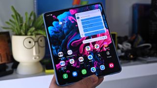
The new Galaxy Z Fold 5 has a lot going for it, but I was dismayed to fire up Gmail only to see the app doing the ‘blown up’ thing where it’s just a bigger version of the standard Android app. Sure, it works, but besides being bigger, it’s not any better of an experience than on a regular slab smartphone unless you suffer from presbyopia.
However, suppose you tilt the Fold 5 into the other orientation (so the crease goes horizontally). In that case, you suddenly get the same app experience on the Google Pixel Fold: Message list on the left with the reading windowpane on the right.
That’s how it should look!
So, that’s cool. I must rotate the phone because Google can’t code for the Z Fold’s admittedly odd aspect ratio.

Gmail on the Samsung Galaxy Z Fold 5 is disappointing to use.

The same goes for Google Maps. Using it when unfolded, it’s just a blown-up Maps, but if you rotate the phone, it splits down the middle with “Latest in the Area” displayed on the left and the maps on your right, which looks much better as you can use your left thumb to swipe up and down instead of reaching with your index finger to use the bottom bar.
Get the Windows Central Newsletter
All the latest news, reviews, and guides for Windows and Xbox diehards.
I can tell you right now no one is regularly rotating their phone around haphazardly for random apps to see if the experience is any different.
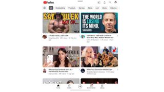
YouTube is a bit better as it shows two rows of videos nicely divided along the Z Fold’s crease, so it’s just doing the tablet experience, but at least it looks OK. Rotate it, and you get three rows to view. Google Photos and Drive also has a menu bar on the left and a navigation panel on the right, making better use of the Fold’s display area, so it’s not all a shitshow.

Google Maps is just a bigger version of itself on the Samsung Galaxy Z Fold 5.

But Gmail and Google Maps are arguably the most used Google apps, and after trying a colleague’s Pixel Fold, I can tell you the experience on that device is much better for those apps, likely due to the broader display aspect.
If this were Gen 1 of the Galaxy Z Fold, I’d be more forgiving, but we’re on iteration five of the world’s best-selling foldable tablet phone, and Google still can’t get the right app experience. That’s shameful, although perhaps not unexpected, given Google’s track record.
What about Microsoft apps?

Microsoft gets its Outlook and To Do apps right on the Samsung Galaxy Z Fold 5.

Of course, you may wonder how Microsoft fairs on the Z Fold 5. Fair question. The answer is mostly excellent.
Outlook gives you the message pane on the left and the window pane for the message on the right, just as you imagine. It looks awesome. Same with To Do, OneDrive, and Word, which have the menu list on the left and the specific item on the right. Microsoft could do a little more to tweak the experience, but at least it makes more sense instead of just making bigger apps.
Some secondary apps like LinkedIn, Microsoft 365, and Authenticator don’t do much. Microsoft Authenticator is forgivable since it’s rarely used, but LinkedIn and Microsoft 365 should be overhauled. I wanted to try Teams, but I couldn’t even log into the app, so who knows about that one?
Microsoft Edge turns into a desktop-looking browser with tabs at the top. It’s OK, but adding vertical tabs would be much better for this form factor. And going by edge://flags, there doesn’t seem to be any immediate UI improvements for the Z Fold being worked on now, which is a shame.
Microsoft could also do more here, but at least its core apps like Word, Outlook, OneDrive, and To Do are taking advantage of the Z Fold’s design.
Foldables still need work, but they are better

As you have probably surmised, Android and foldables are a slow burn. Yes, it’s getting better with each Android release, and Samsung does a lot to add value to its Z Fold series to optimize that giant 7.8-inch display. Still, we’ll need more support from major app developers, especially Google, who should have taken the lead from day one.
The good news is Samsung at least makes this all a bit easier to swallow, thanks to its heavy Galaxy Z Fold 5 trade-in deals.
Stay tuned for my full review of the Samsung Galaxy Z Fold 5.
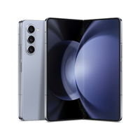
Samsung Galaxy Z Fold5: from $799.99 at Samsung
With Samsung's pre-order deals, you can save a ton of cash by trading in your device and taking advantage of bundling options for the new Watch6, Tab S9+, and much more, as long as you order before Aug. 11, 2023.
Also see: Samsung Galaxy Z Flip5 | Samsung Galaxy Watch6 | Samsung Galaxy Tab S9

Daniel Rubino is the Editor-in-chief of Windows Central. He is also the head reviewer, podcast co-host, and analyst. He has been covering Microsoft since 2007, when this site was called WMExperts (and later Windows Phone Central). His interests include Windows, laptops, next-gen computing, and watches. He has been reviewing laptops since 2015 and is particularly fond of 2-in-1 convertibles, ARM processors, new form factors, and thin-and-light PCs. Before all this tech stuff, he worked on a Ph.D. in linguistics, watched people sleep (for medical purposes!), and ran the projectors at movie theaters because it was fun.
